
By Kirsten Hoogstraten // @Kirsten_Hoogs
Hey MLS Female fans, it’s been a hot minute but I’m back! (I have a habit of saying this every article…sorry) In all honesty, it has been really difficult to keep up with being a writer for a team that is halfway across the country. I don’t know how Araceli does it, but she’s great at it! So, I have stepped down from being the Sporting KC reporter. I still plan on writing, just different types of articles. This will also hopefully give you, our readers, some fun content that might not be team specific.
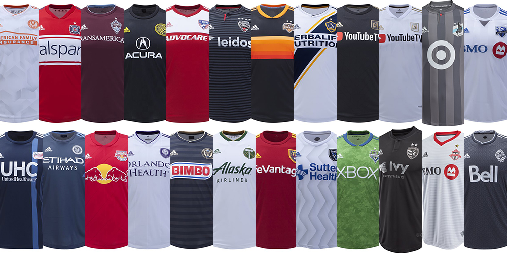
Now, down to business. It’s 2019 and we have new kits to critique! First thing though, I have a bone to pick with MLS and Adidas. Long-sleeved jerseys have been taken from us, and that means all of us. Ilie Sanchez now must bare his arms to the world and I’m not okay with that. Now how will you get you someone who loves you like Ilie loves his long-sleeved jersey? This is a travesty!
The Reviews
Atlanta United
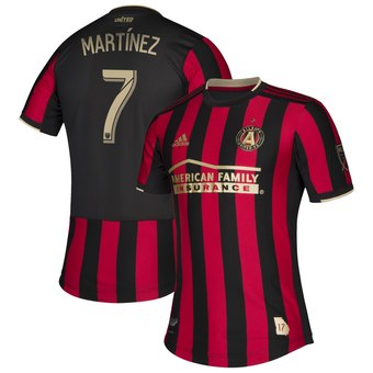
Atlanta’s color combo is really solid. The red and black look sharp together, and the gold accents pop and add a touch of class. My favorite part of the jersey is the jock tag in the shape of Georgia. That is classy.
There is a slight problem though. Adidas has introduced this new back panel on some jerseys (the giant black thing) and it makes the Atlanta players look like they’re old-timey prisoners with striped shirts and a cape plastered to their backs.
Oh…and there’s a star now.
Chicago Fire
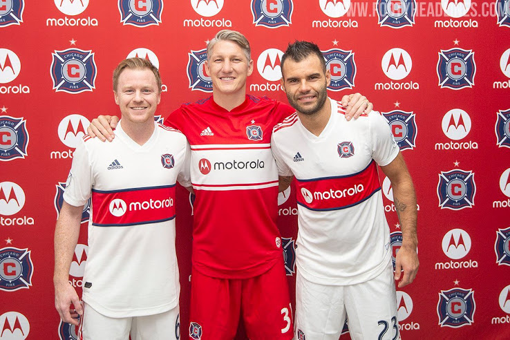
My first reaction to these jerseys was not good. Every continued reaction was…not good. These are rough. They’re not that different than the old Valspar design, but something about the Motorola logo makes them look weird. The secondary kit is definitely not as good as the grey ones introduced in 2017. These are both far better than the Quaker jerseys of 2014…yikes.
Chicago, you have one of the coolest city flags. People love it so much! (If you think city flags are cool, check out this Ted Talk) I love it and I’m not from Chicago. You’re our rivals. We frequently chant to burn your city down. Again! (We don’t really mean it) Why can’t you do something cool with that? The Bulls did it, and it was amazing!
FC Cincinnati
Welcome to the league, boys! Let’s see what you brought to the table.
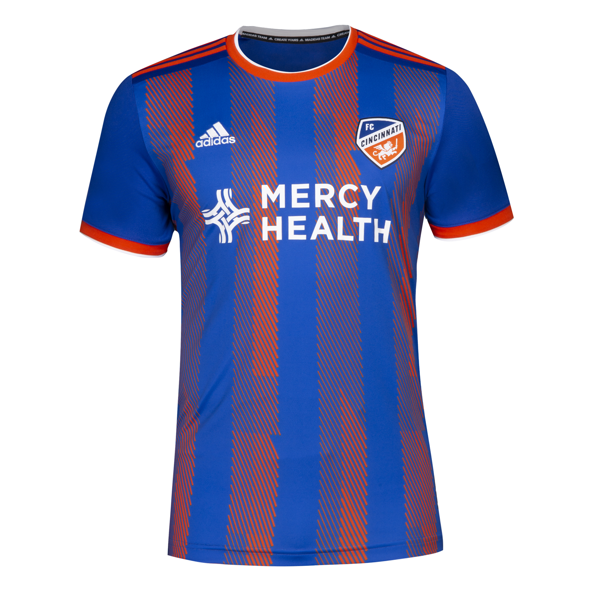
Ummm…these are fine, I guess. Blue and orange is a super cool combo, there is so much potential! But there are a lot of these weird pixelly, stripey, not solid design elements in jerseys this year, and I’m not a big fan. Back in 2017 when Cincy surprised Chicago in the U.S. Open Cup, their jerseys were so good! Everyone loved the USA Bomb Pop jerseys and they were the same, just blue and orange! Bring those back!
Now these…
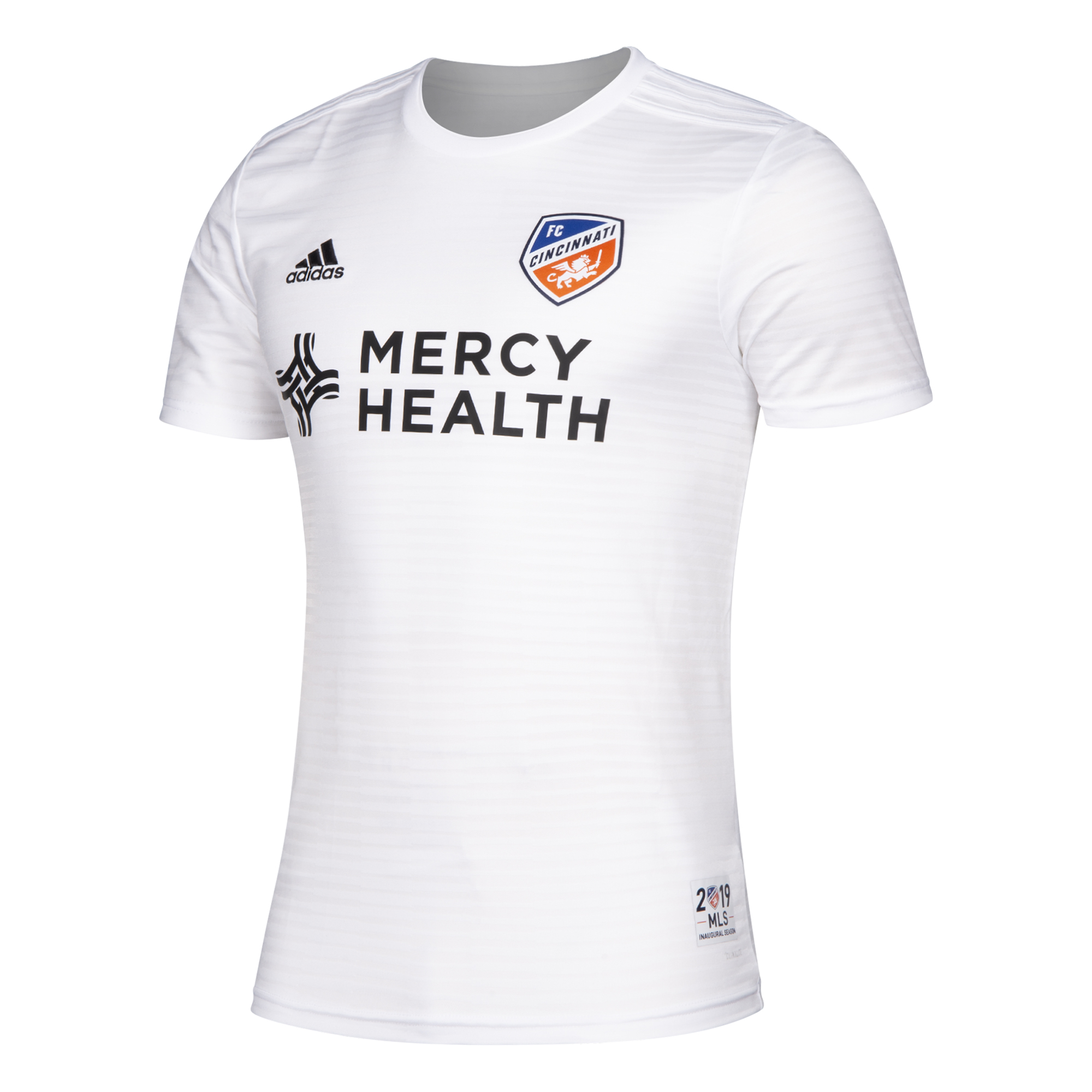
…are beautiful! Wear these all the time! I can’t say anything bad about these. The Mercy Health logo is sleek, the inaugural season patch is visually interesting, and the subtle striping is lovely. Well done!
Colorado Rapids
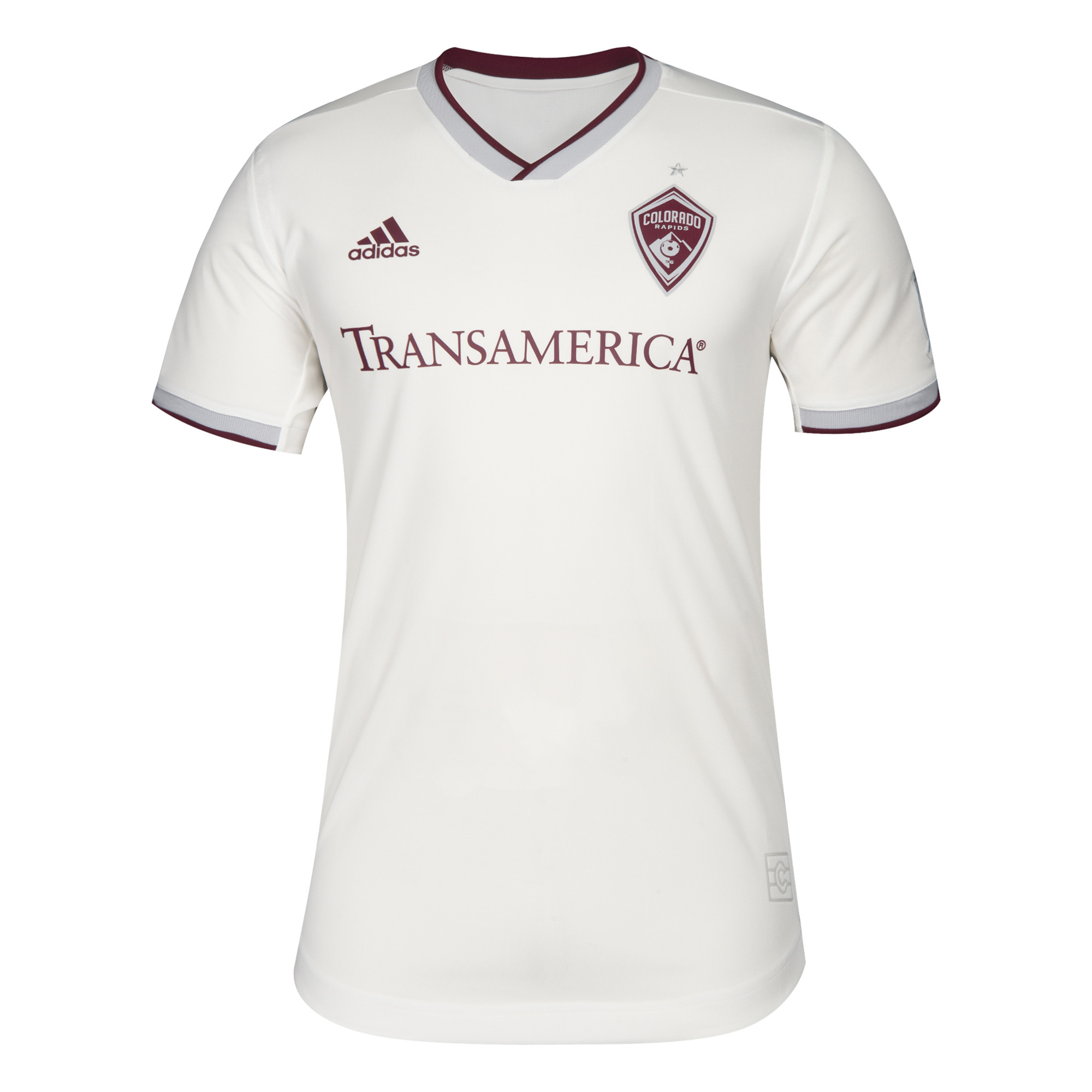
Colorado is only getting new secondary jerseys this year, and they also went with a mostly white design. I don’t like these near as much as the Cincinnati jerseys. The accent at the cuffs and neck along with the burgundy make it look more retro. If they lost the weird grey stripe it would probably be better.
Borussia Dortmund…I mean Columbus Crew
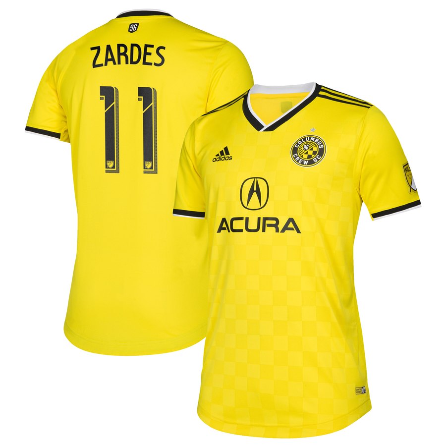
Fun fact: I’m blonde. Another fun fact: I look terrible in yellow. Kate Hudson, I am not. Another fun fact: I love Borussia Dortmund’s jerseys and will stare at them longingly while I wear their black secondary that is far more complimentary to my skin tone.
This is a Borussia Dortmund jersey. They must be moving to MLS and we should all be scared for theirs will be a dynasty for the ages. But, since this looks exactly like a BVB jersey that means I like it.
FC Dallas
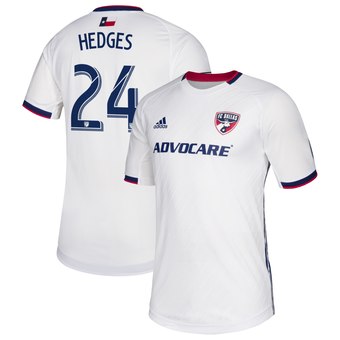
FC Dallas’ new secondary is way better than their weird half and half ones from last season. Like waaaaaaay better. The Lamar Hunt patch continues to be a nice touch while also looking exactly like the EPCOT ball. I am not a fan of the half collar and cuff. It makes it look like their moms ran out of trim and decided no one would notice the insides of their arms.
D.C. United
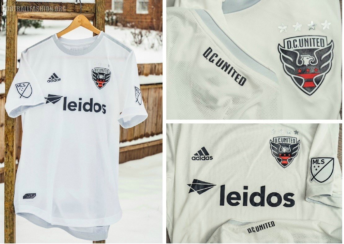
The D.C. United jersey took its senior photos in its aunt’s backyard in the ‘burbs, obviously. Regardless of the location, these new secondary jerseys are really good. I love the white and silver. It reminds me of the Sporting KC argyle third alternates from 2015, and those are my favorite. The thing I don’t like is not the jersey’s fault, but the crest is big and obnoxious.
Houston Dynamo
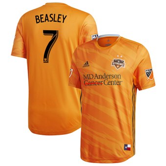
How is DeMarcus Beasley still playing? Does he never age? Will he somehow make the next World Cup roster much to the chagrin of everyone?
It’s hard to make a completely orange jersey look good, and Houston did not succeed. The tiger stripe is weird and the three stripes on the side, paired with the wrong design, makes it look like a jersey for a kids team from the 90s. Just wear the cool black chevron secondary jersey a lot.
LAFC
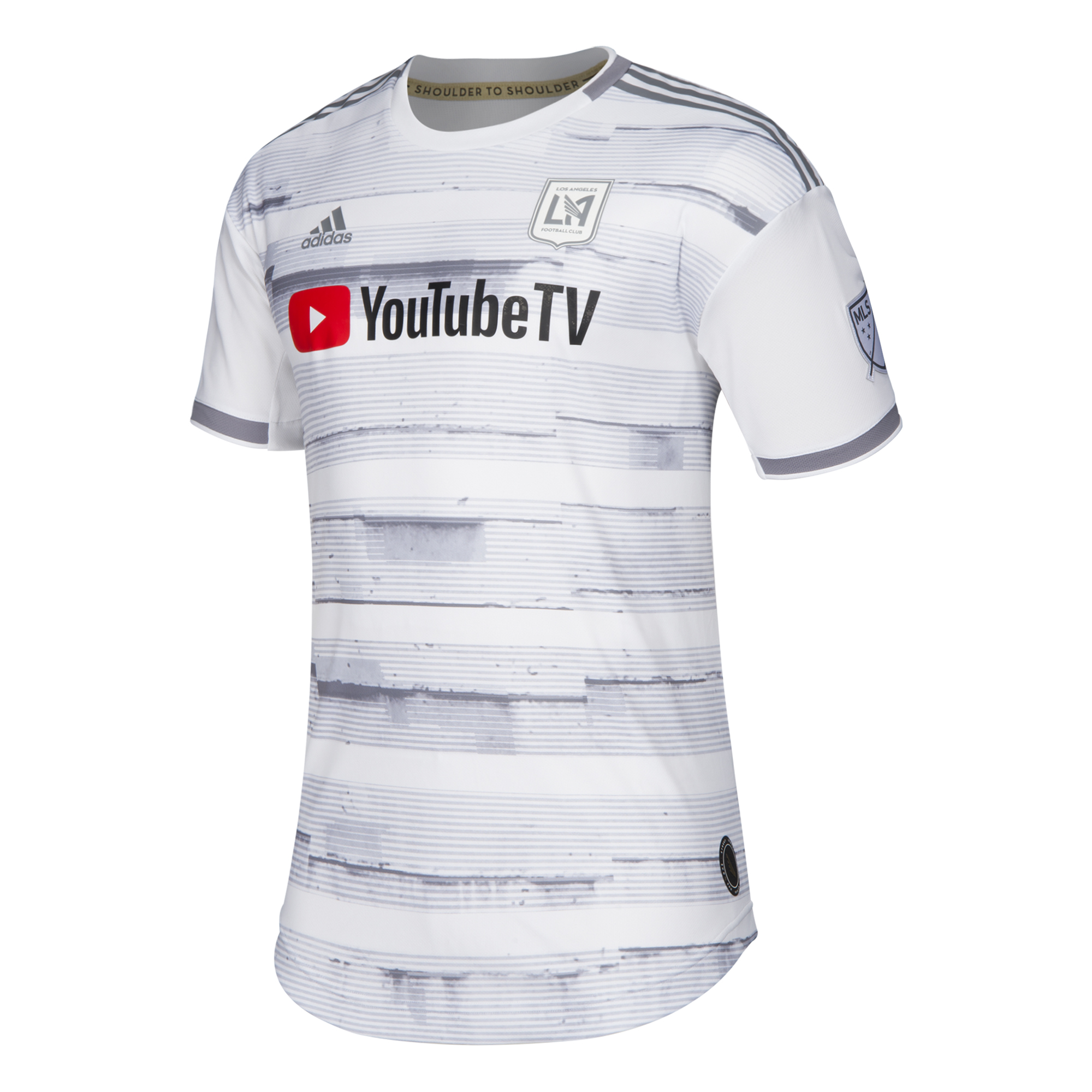
This is a birch tree. Why are they cosplaying as birch trees?
LA Galaxy
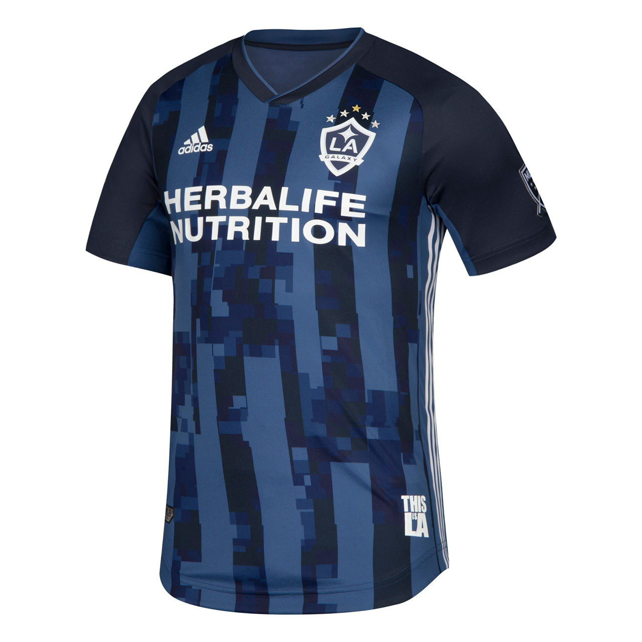
What is wrong with Los Angeles? Are they trying to see how bad they can make their jerseys before their ridiculously rich fan bases stop buying them?
The lighter blue vs darker blue works really well, but this pixelated look is not good. Why would you want to purposely make it look like the game feed isn’t buffering correctly? Oh, and the jock tag is so tacky.
Minnesota United
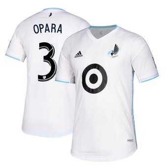
Minnesota United is heading into their third season, and they have yet to disappoint on a jersey. Though the Target logo is kind of obtrusive, it never looks bad. The light blue with the white is clean and sharp. This half collar here looks nicer than Colorado’s because it doesn’t have that awkward extra color in there. Nice job, Minnesota. Now give back Ike.
Montreal Impact
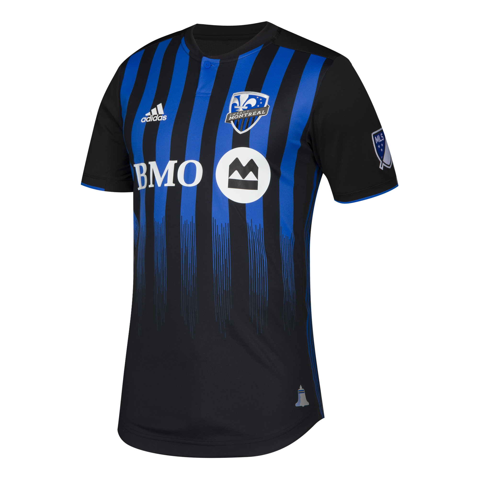
Is this the season of not finishing designs? This looks like they were painting their siding and let the brushes get dry. Lucky for Montreal, this looks better than the Galaxy, Cincinnati, and the fighting Ents (LoTR joke, anyone?…anyone?) The blue with the black is a great color combo. I just wish the stripes went all the way down.
The BMO logo would be better if it was just the letters. The large white circle is rough. The jock tag in the shape of the North Star Bell is a really cute touch.
New England Revolution
I have, in the past, mentioned that The Revs aren’t real. They don’t actually exist, but that’s probably just because they’re living back in 1996 with their crest.
This jersey is so cluttered. The UHC logo is huge! It’s also not interesting in the slightest. It was designed by a robot who had access to two fonts, and it used one for the big letters and the other for the small. He also didn’t understand the spacebar. The weird color sandwich of pastel blue and white looks weird.
NYCFC
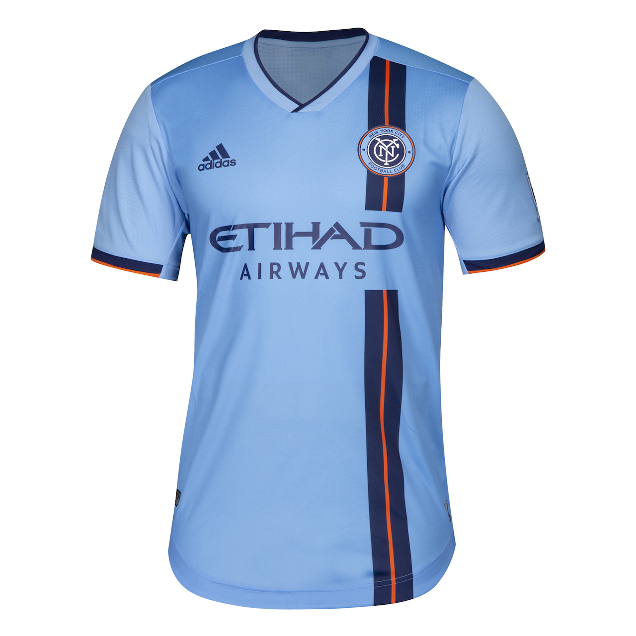
So, I just talked about the Revs, but I guess they’re back because these are their primary uniforms in blue, navy, and orange. I do think the stained glass pigeon jock tag is a nice touch. I just don’t know what it has to do with New England…oh this is NYCFC…oops
New York Red Bulls
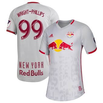
If you look at the upper third of the front of the jersey and the upper two-thirds of the back then this is workable. Unfortunately, they let the designers from the Matrix put weird unreadable words on the front. They’re supposed to be glitchy, but the only time I want to see a glitch is during a speed run on Twitch.
Oh, and if you forget who they are, you can read their name on the back of their jerseys as they are walking into the off-season after losing in the quarter-finals of the playoffs. As is tradition.
Orlando City
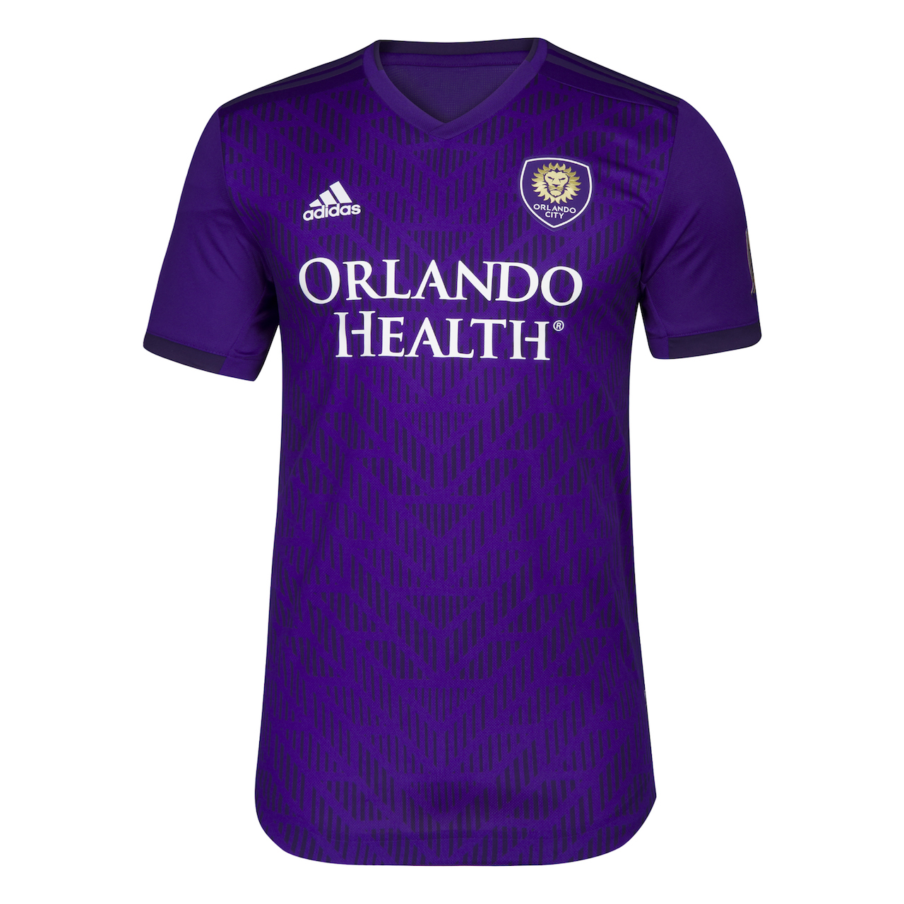
Orlando City is really hoping their fans dig the pattern on their jerseys because that is all they have. That’s not true. These aren’t polos, and that is the best thing about them. They also don’t have the ugly gold shoulder stripes that last year’s jersey had. So I guess I don’t mind these simply because they are not last year’s.
Philadelphia Union
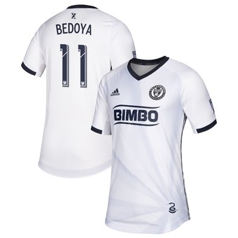
I am torn on these guys. The more I look at them, the more I think they’re alright. I wish there was one more color in either their crest or the sponsor logo. But the light blue rays radiating from the little snake look pretty cool.
This is also the first MLS jersey with a customizable back tag. The back tag is the little guy above the player’s name. The Union held a competition and the fans voted on the winners. Nifty.
Portland Timbers
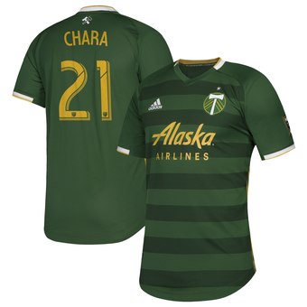
The Timbers are masters of camouflage. It is next to impossible to see them when you watch on tv. These do look more vibrant in the light. If you check them out in the promo pictures in front of the Alaskan Airlines plane you can see.
The hoops are a really classic silhouette, and it’s refreshing to see a team use a full accent and not a weird incomplete thing. The gold is rough. Atlanta does gold really well, but they manage to get a real gold color and not the weird off-yellow. This is probably the best jersey Portland has ever had.
Real Salt Lake
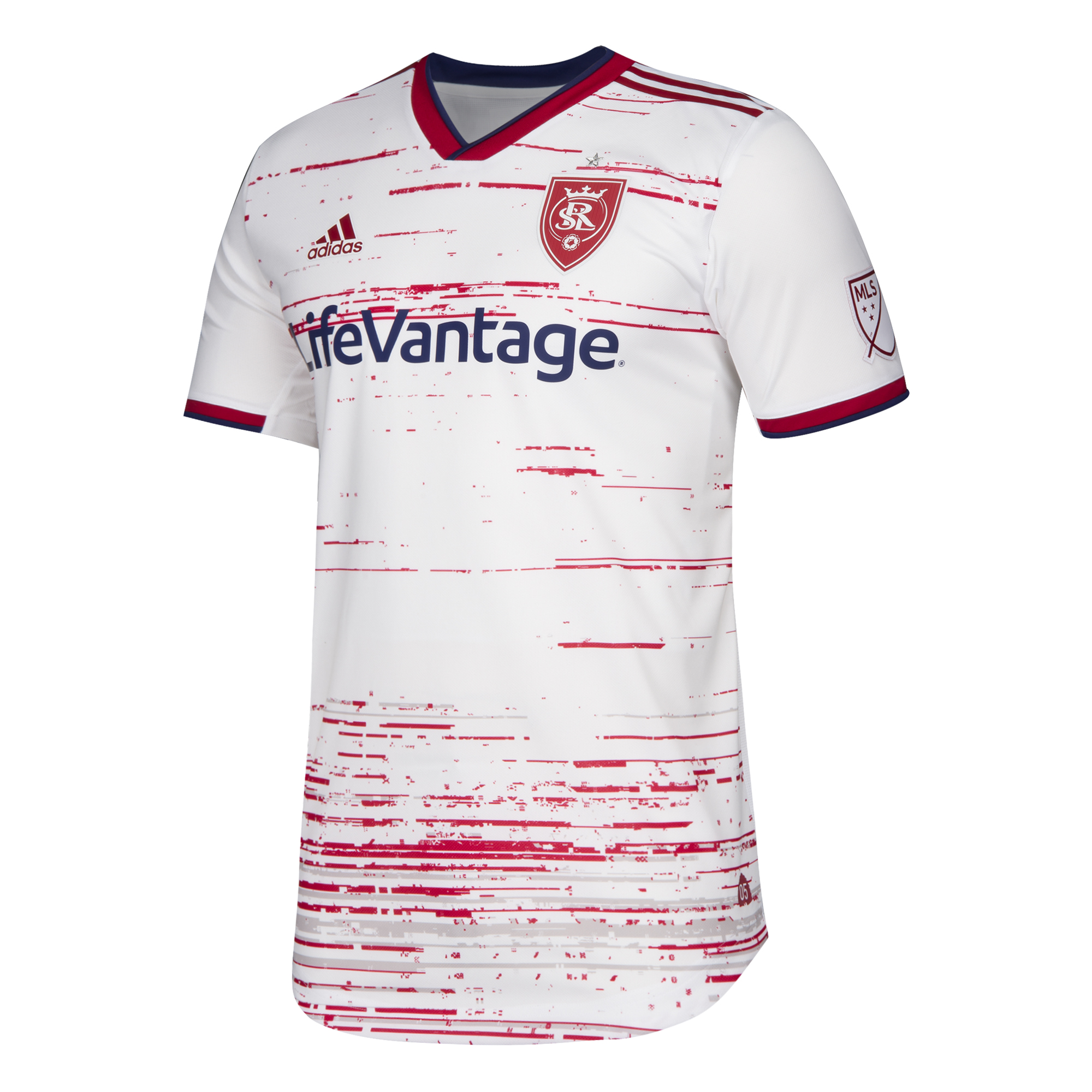
Guys, someone spilled spaghetti sauce on my clean white jersey. At least they kept the sleeves clean. They also managed to pull all the color out of the crest. That’s weird. Must be some fancy spaghetti sauce.
San Jose Earthquakes
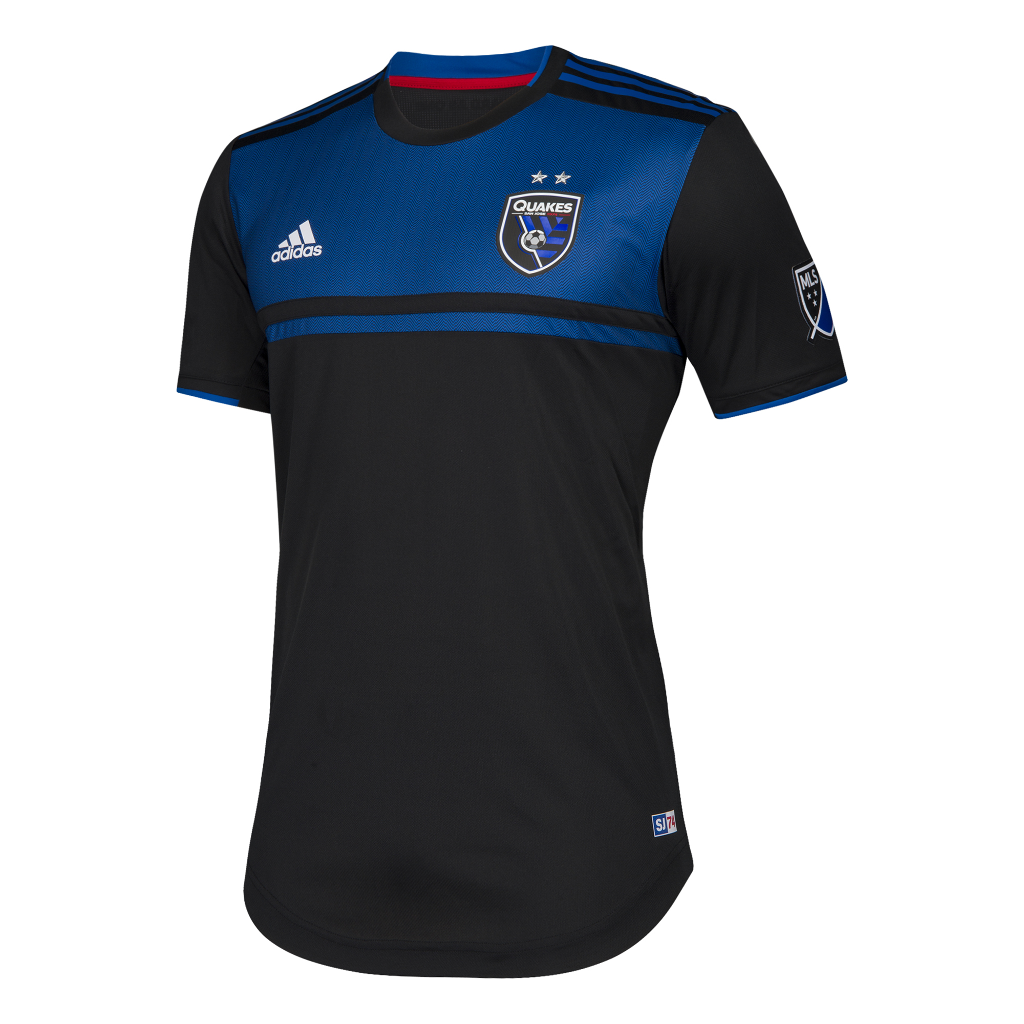
I give San Jose some flack for naming themselves after a natural disaster that ruined their city (I’m also looking at you, Chicago), but this jersey is really good. I like the clean lines and the one separate stripe at the bottom. I can’t say anything bad about it. Except for the jock tag. It’s dumb.
Seattle Sounders
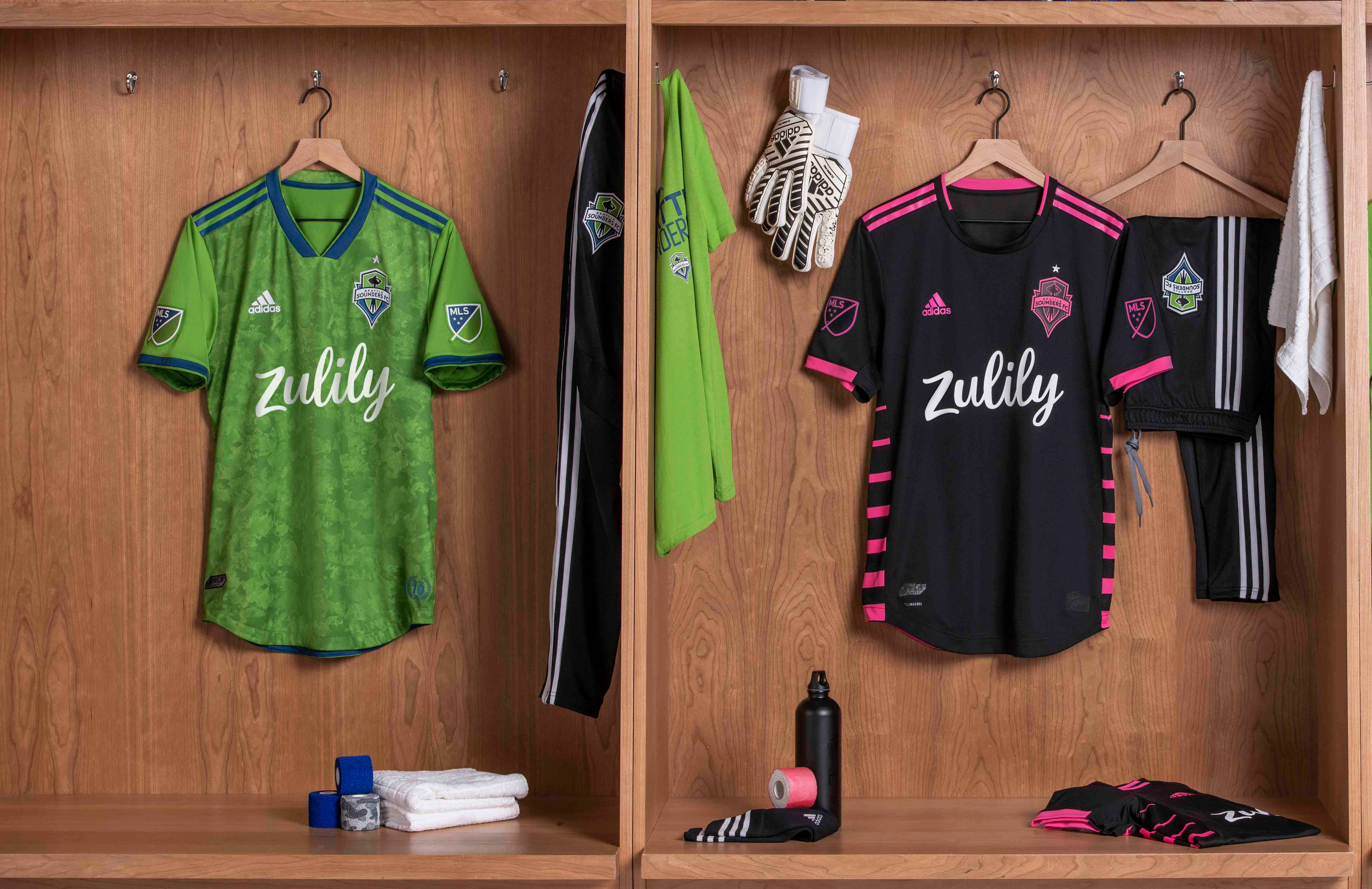
Seattle is a lesson that a change in sponsor can ruin a moderately okay jersey. Zulily is a great website. I look at it at least once a week, and I buy something from there about once every 50 times I look at the site. Their shipping is too expensive!
So, the primary basically just changed the logo, and now it’s bad. The new secondary is kind of cool if you know the backstory or care about a Cascadia Cup game from five years ago. The pink is an interesting change. I can’t tell if I dig it yet or not, but it is better than the primary.
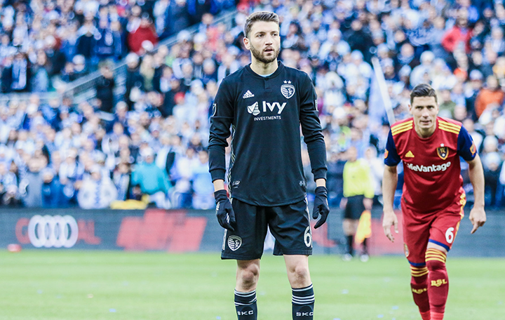
Sporting KC
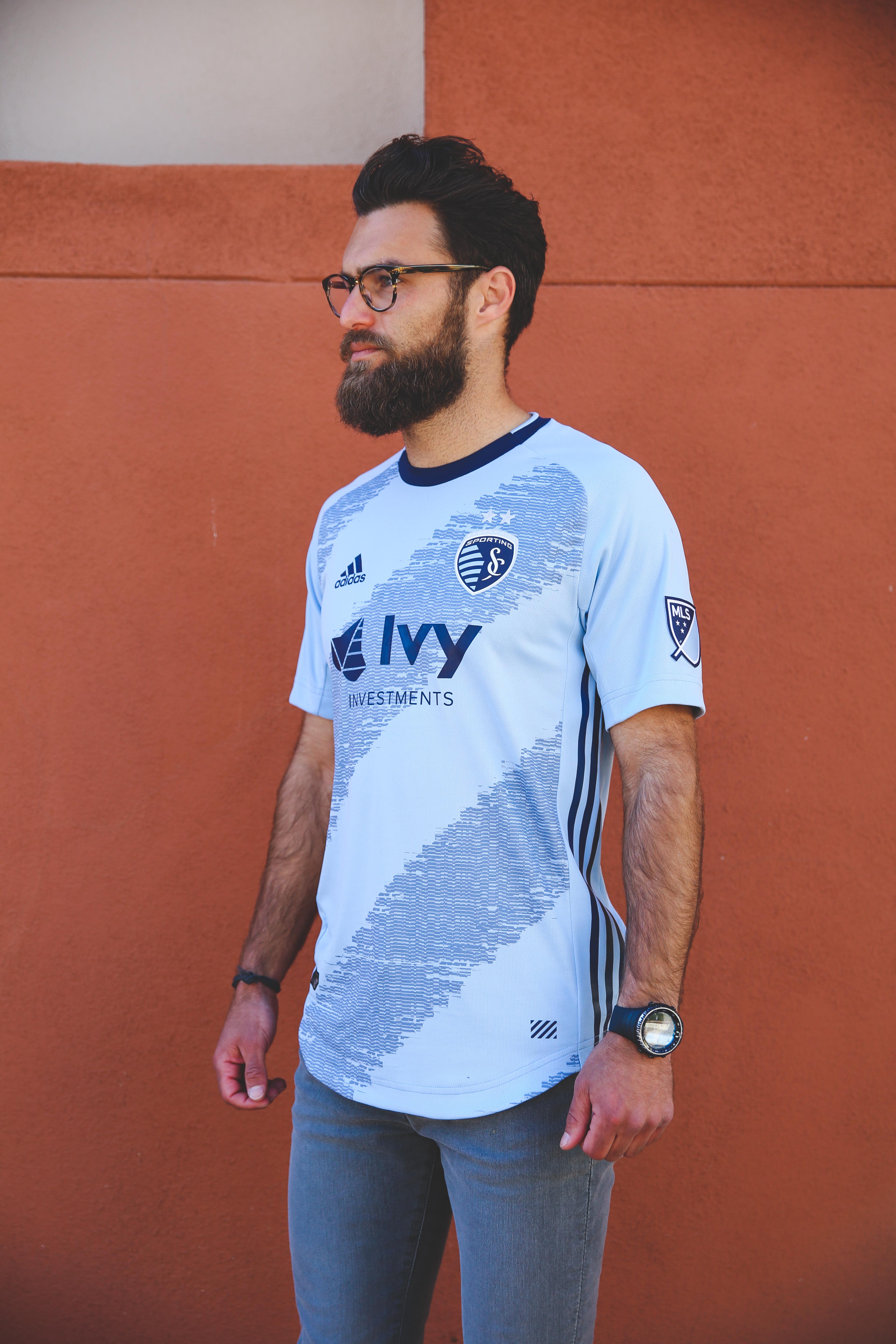
And now for my boys in blue, Sporting KC. My favorite thing about this jersey is that it has a crew neck. Sporting hasn’t had a crew neck jersey since the hoops in 2014, and as a person who likes neither polo necks nor henleys I think this is a great move.
The light blue is always a good color. They’ve paired it with a color they call “raw grey”. This jersey has gotten a lot of criticism from the SKC faithful, mostly because all the players look like they’ve been run over. I can’t tell if I like it or not. Sometimes I do and other times I don’t, but I do wonder what it would look like with long-sleeves…
Toronto FC
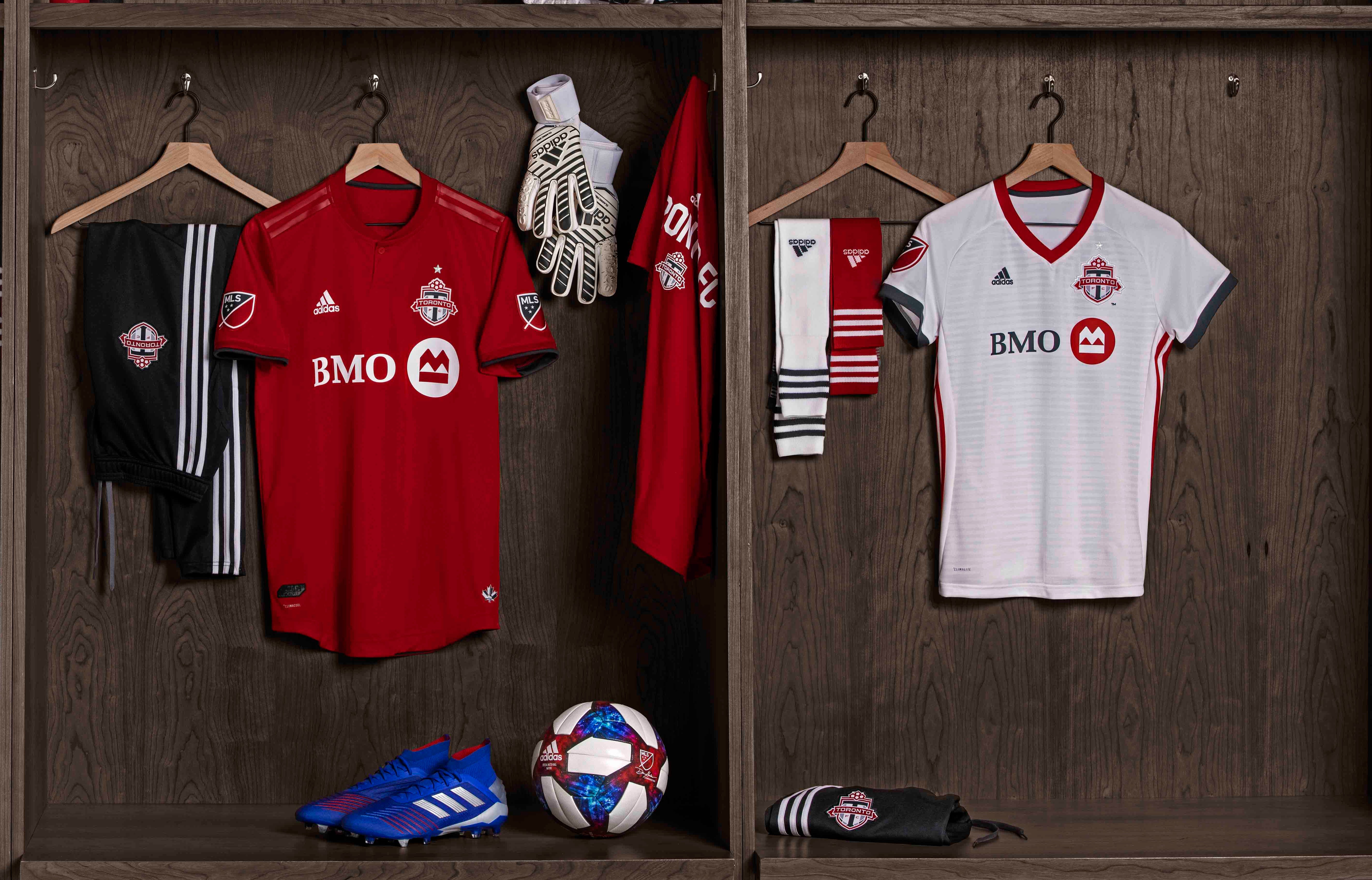
The winner for least original jersey combo goes to Toronto FC. They come to the field in 2019 with a red mock turtleneck and a Real Salt Lake secondary that someone scrubbed the spaghetti sauce out of.
Vancouver Whitecaps
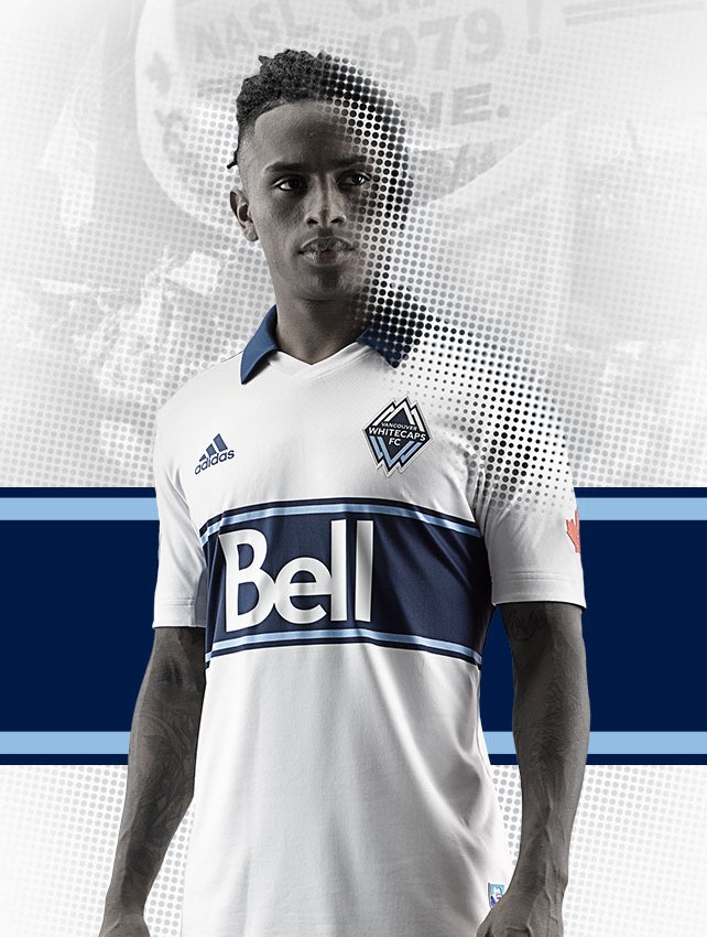
Where is the person who designed the 2015 Vancouver jersey? Please find them, bring them back, and let them fix this, or just bring back the 2015 jerseys. So polo collars are bad. These weird jerseys where it looks like they’re wearing a v-neck over a polo are worse. This is literally the worst neckline possible. If you changed up the neckline, Vancouver could go hang out with Chicago in the giant chest hoop club.
I’m just upset with you, Vancouver. You can do so much better. You have done so much better.
The Rankings
The Top Five
5. Columbus Crew Primary
4. Minnesota United Secondary
3. D.C. United Secondary
2. San Jose Primary
And the obvious winner
1. FC Cincinnati’s Secondary
The lesson here: if you have a really clean white jersey with a smart accent color it will be a hit.
The Bottom Five
This one is way harder…
5. Tie: Real Salt Lake’s super fancy ‘sketti sauce
5. Tie: The bottom two-thirds of the new Red Bull’s jersey
4. Vancouver’s unfortunate new collar
3. Houston’s response to William Blake’s “The Tyger”
2. Seattle’s over-priced shipping primary
The obvious loser
1. LAFC ode to a birch tree
There you have it folks, an obnoxiously long article talking about every jersey and TL;DR-ing the ranking at the very end with no pictures. Sorry.
I hope you at least had a chuckle. See you next time!
Featured image: Soccer365
Follow and chat with me on twitter // @Kirsten_Hoogs
Check us out on instagram @mlsfemale

Themes seem to be glitchy and plain white. I could do without either.